Last week, I talked about Corridor Kids Pediatric Dentistry, a fusion of dentistry and spa treatments that myself and the design team at Primus Dental Design and Construction created recently.
Secondary Colors Play a Primary Role
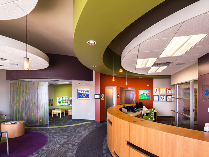
The dental office has to appeal to parents because they are the ones taking their children there. At the same time, the children have to love it, too. So, we made sure to put a lot of color everywhere.
Dr. Vargas wanted a big-city practice, not a rural Iowa practice, but she wanted to avoid a cold and sterile look.
To keep it sophisticated and kid friendly, we used secondary colors rather than primary. Additionally, these secondary colors are muted and used as accent colors. The main color of the office is taupe, a color that really sets off the artwork and the accent colors.
We Are Living in a Material World
Another key player in the mix is the materials that we use. For this project, we used a number of fun materials.
Patterned Glass
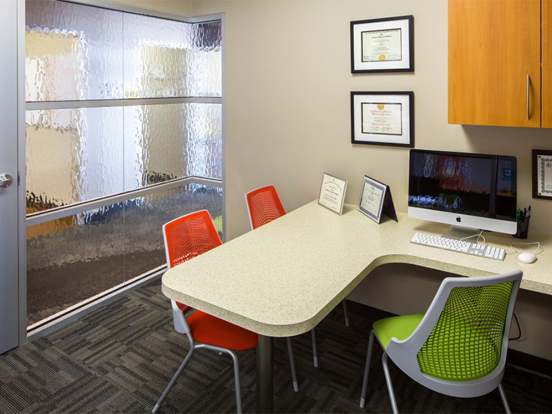
We used patterned glass in the office cubes. It allows light to come in and makes the space feel airy and open. At the same time, since the glass is obscured, it is still private. People on the outside can see that there are people in there, but they can’t see who it is or what they’re doing.
Resin Panels
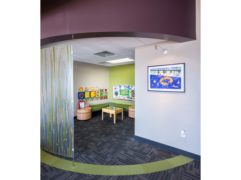
We used resin panels to separate the kid’s area and the reception area. We decorated it in natural materials – plants, grass, and flowers. These elements bring in nature so that year-round they will have green, flowery, plant material that, hey, you don’t have to water!
There are resin panels that separate the patient corridor from the treatment area as well. The pattern is different, it looks like bamboo, but it still has a similar effect.
Separating areas helps keep it more sophisticated because it creates an adult area and a patient area.
Wood Laminate and Vinyl
Wood grain gives the office a more comfortable look so that it doesn’t look sterile. The use of artificial wood, though, is more appropriate for a medical facility. Laminate and vinyl are more durable and hygienic.
The wood compliments the resin panels while contrasting the silver aluminum framing that surrounds the glass cubes.
As you can see, every aspect of a dental practice helps to create a cohesive look and mood. As I mentioned in a previous post, there are literally millions of options to choose from. That’s why we’re here. We can help you narrow down your choices until you have the practice your dreams.
~KC, Head Designer at Primus Dental Design and Construction


