As head designer for Primus Dental Design and Construction, I talked about the step by step dental office design process last week. Now, I thought it would be fun to show you a recent project we worked on.
Dr. Kaaren Vargas, of Corridor Kids Pediatric Dentistry, is a pediatric dentist that we worked with about 6 years ago. As a start-up, she had a conservative budget and her office was 2,000 square feet. It was a cost-effective office.
Since then, she and her office have done well and needed to expand her office. Great!
She is a pediatric dentist and she had the excellent idea to make sure to appeal to the parents, too. She focused especially on the moms who bring their kids in.
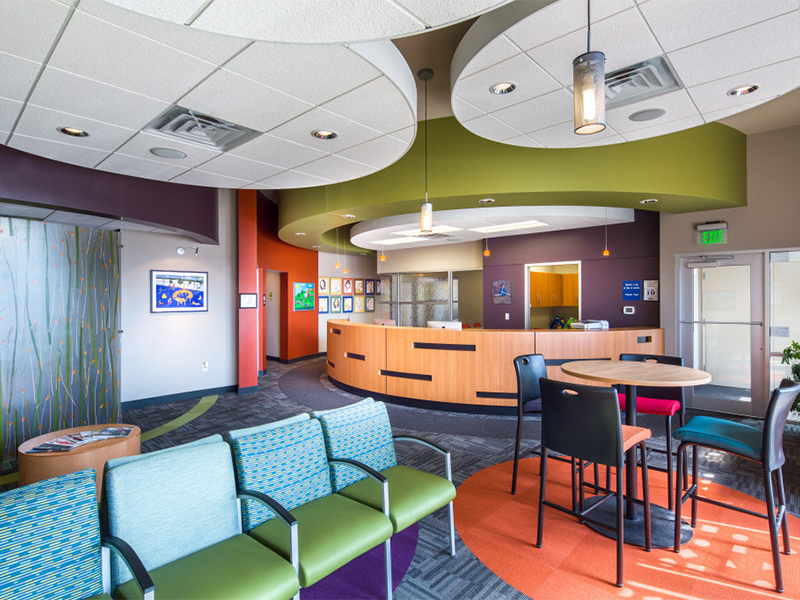
She decided to give the office a spa-like atmosphere. The reception area is comfortable and sophisticated. Not only that, but the office also offers spa services, such as massages and even mani-pedi treatments. Pretty genius, right?
Not often do we blend two different industries like this, so it was unique and fun for us!
Playful with an Air of Sophistication
We employed a lot of techniques to mesh these two worlds – the sophisticated mom and the playful child.
Shapes
We used a lot of curves in this project, which is sometimes done in a dental office. Curves add some fun to the space in this case.
We added curves in these ways:
-
The reception desk is circular
-
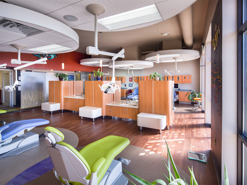
There are circles in the carpet and on the floor of the open bay
-
There are circular “clouds” hanging from the ceiling
-
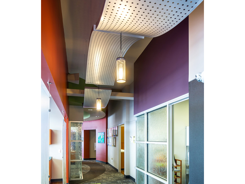
Vertical metal panels that curve are in the back corridor
I also juxtaposed curves with rectilinear shapes. For instance, inside the curve of the reception desk there is a square cube of glass. That cube holds the manager’s office. There are also rectangles cut into the front of the reception desk.
Down the corridor, Dr. Vargas’s office pops out from the wall as a glass cube.
Custom Creations
For this particular project, I created a custom piece of furniture for the open bay. This cabinet separates the two sides of the open bay.
The cabinet has 3 verticals and 3 benches. There are two sinks there and one is lower for younger kids. There is a mirror between the verticals. The picture here makes it look like it’s open, but if you look closely, you’ll see that it’s actually a reflection!
On the sides of the cabinet, there are glass doors that contain panels that create a shelving grid. The squares hold toys for the children to look at. They can’t take them out, there is a childproof, magnetic latch on the door. In an open bay area, it’s not really safe to have toys laying around all the time, but the toys are visually appealing to kids.
Creative Lighting
To match with the atmosphere, we used subdued lighting. There are delicate light fixtures that highlight the artwork.
(Fun Fact: Dr. Vargas’s mother is the artist behind the paintings that decorate the office. Unique touches like this add a great, personal element to your office!)
There are also fun, orange accent lights over the reception area.
Cylindrical lights pop through the perforated metal panels in the patient corridor. You can see how we specify each element to have it all tie together – from the curves to the metal panels to the silver aluminum frames, every detail works together to create a cohesive look.
That’s all for now. Next week, I’ll tell you even more about how we tackled this fun project!
~KC, Head Designer at Primus Dental Design and Construction


