You know the saying, “You’ll never get a second chance to make a first impression.” While that usually is in reference to you as a person, the same can be said for your dental office.
If your entryway lacks the professionalism, quality, and personality of your office, it isn’t helping you to bring customers in.
The way you approach your entryway design depends on a few variables. Today, I am going to focus on the type of building your dental office is in.
In a Retail Strip Center
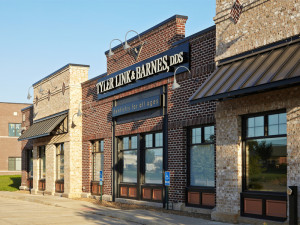
If your dental office is sandwiched in between a few different businesses, you need to find a way to stand out and get noticed.
For this office, we used a large, dark blue sign and classic, cream-colored lettering for nice contrast. This sign does the job – the practice gets noticed and the impression given by this entryway is a high level of professionalism.
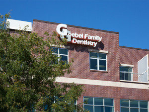
Since this practice is on a second floor, we used a 3D technique to really grab the attention of potential clients on the street. Again, the use of contrast with white lettering on a brick wall helps guide wandering eyes to their practice.
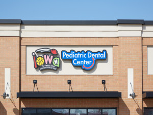
Since this project was for a pediatric dental office, we were able to use bright colors and playful fonts that pop against the simple background. Any child walking by will want to see this dentist!
A Stand-Alone Practice
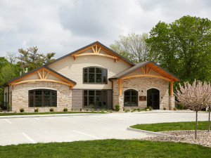
When you’re working with your own building, you have a little more flexibility. You can employ architectural elements to really establish your unique branding and overall reputation.
The wooden arch work on the entryway of this office repeats inside. By using it on the outside, we set the tone for the rest of the building. When patients walk in, they already feel comfortable with the design because they saw it on the outside.
Furthermore, wood is a unique element for a dental office exterior. It shows that they are warm and friendly without having to come right out and say it!
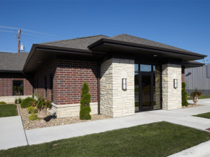
The stone pillars that frame the door of this office are white, which gives the medically clean image that any dental office needs, while still looking inviting. Manicured lawns and landscaping give patients the sense that this office pays attention to detail – a good quality for a dentist to have!
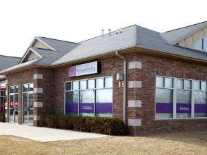
Why not tie your branding into your entryway? This practice has a purple theme throughout, so it made sense to portray that from the exterior in addition to the interior. Window treatments really help your office stand out in a sea of other buildings!
If your office is in serious need of an entryway overhaul, we know all the tricks in the book. Give us a call and we will make your first impression a great one!
~ Jason

