So, you’re ready to rebuild, remodel, or rebrand your dental office. There are so many things to do, as you’ve seen if you read the last few blog posts. You might be wondering, “Where do I even start?”
Good question!
The best place to start is to decide who your ideal client is. When you have that figured out, you can start with the branding process.
Branding for Your Physical Dental Office
Your physical dental office plays a big role in your brand. Your website and logo need to work in conjunction with the feel of the office.
With this in mind, there are a few design themes you can choose from. Of course, there are no hard and fast rules. It is nice to have a general idea, though, so that we can move forward with a specific direction in mind.
A Few Different Themes
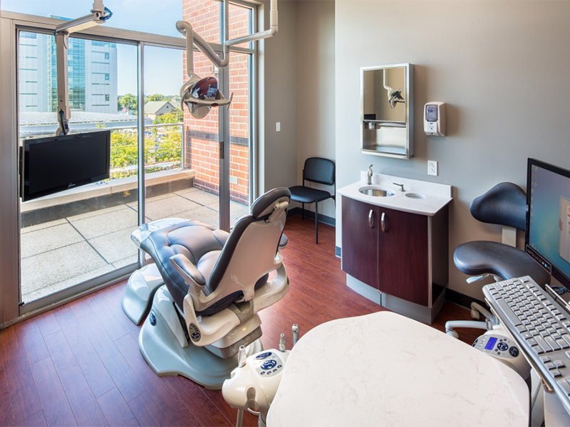
Traditional
Traditional dental offices have darker woods and darker colors in general. We tend to use a lot of wood trim in traditional projects. We don’t use any whimsical colors or shapes. This example comes from a project we worked on in Illinois for Goebel Family Dentistry.
If you are attracted to clean lines and simple decor, traditional may be the way to go for your office.
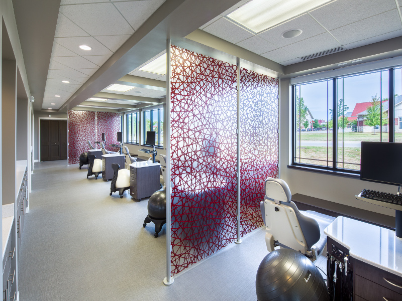
Modern
For a modern, contemporary look, we use lighter colors. We use fun shapes, like the circular clouds we used in our work with Corridor Kids Pediatric Dentistry. We use accent colors in various ways, such as in the photo above. We used red in the glass panels that separate the patient chairs.
If you are a pediatric dentist or just love colors and shapes, a modern design will be great for your practice.
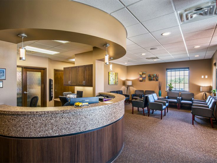
Transitional
Transitional style is a blend of both the traditional and contemporary, for both the dental office design as well as the furniture, fabrics, materials and accessories used. The goal is to create a simple, classic, but sophisticated design that is timeless.
The office palette is generally neutral taupe, with accents that range from vanilla to espresso. Accessories, fabrics and furniture provide a nice contrast with the architecture in a juxtaposition of color, texture and shape.
Overall a lack of ornamentation keeps the focus on the understated yet sophisticated design.
Your Style
If you see a style that you like from these three examples, then you can begin to imagine your new dental office with a little more clarity. We will add in elements that work best for your space and your clientele, as well as bringing in some personal touches.
What it all comes down to is an office that has the look and feel that makes you and your patients the most comfortable.
~KC, Head Designer at Primus Dental Design and Construction


