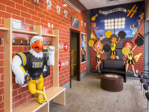
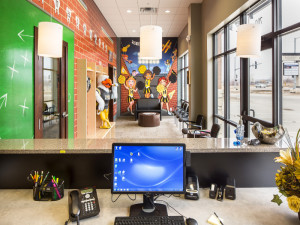
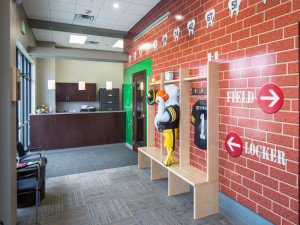
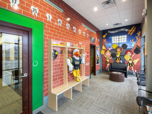
An office that looks fun and inviting can pretty much sell itself, right? Who wouldn’t want to come hang out in an office that has a Tooth Hawk?!
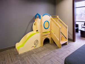
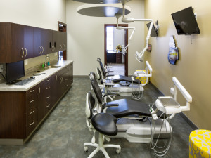
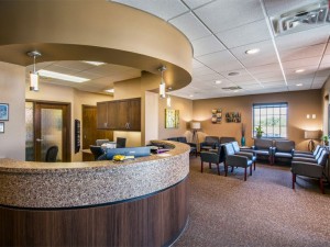
This was obviously an office designed for a pediatric dentist. This highlights the importance of knowing your target audience. For a more grown-up feel, check out our projects page!
~Jason

